Showing posts with label architectural. Show all posts

Sunday, 23 June 2013

PIXEL

PIXEL in Beijing by SAKO Architects.

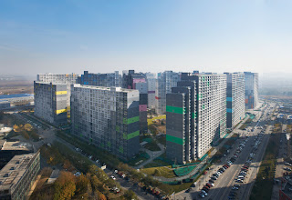


This complex is composed of 10,000 units of commercial units, residential units, and office units placed on an area of about 210,000 square meters. 19 residential towers are placed uniquely on the site in order to meet the demand for its privacy and hours of sunlight as the residential units.
Twelve numbers of plate-shaped buildings are placed along the outline of the site. The other eight numbers of plate-shaped buildings are placed along the lines in which were led by a slant line running along Chaoyang North Road and the two right-angled lines of the slant line. Therefore, each building has a certain distance to the others by virtue of its “windmill-shaped master plan”.
The elevation design of the buildings is another unique part of this project. Each tower is composed of piled-up units with eight different tones of color of gray. This strategy gives one continuous flowing pattern for the facade of the twelve buildings along the outline of the site. In addition, different tones of one additional color for each building create ten different gradient colors for the buildings, and this gives the sense of coherence to the whole site.
(Source: europaconcorsi.com)

Sunday, 9 June 2013

Frank W. Thomas House

Frank W. Thomas House, 210 Forest Avenue, Oak Park, Illinois, USA

The Frank W. Thomas House was commissioned by James C. Rogers for his daughter and her husband, Frank Wright Thomas. In some ways, it resembles the Heurtley House: both homes have leaded glass windows, an arched entryway, and a low, long profile. The Thomas house is widely considered Wright's first Prairie Style home in Oak Park. It is also his first all stuccohome in Oak Park. Using stucco instead of wood meant that Wright could design clear, geometric forms.
The main rooms of the Thomas House are raised a full story above a high basement. The L-shaped floor plan of the house gives it an open view to the north and west, while obscuring a brick wall located on the south side. A "false door" is located just above the arched entryway.


Wednesday, 5 June 2013

Drawing of the day - 02

Here's another one for your viewing pleasure: http://www.youtube.com/watch?v=zXt3slWL-KU
Hope you like it!

You can also subscribe to this channel because more cool and nice stuff are on their way. :)

See you again soon!

Tuesday, 4 June 2013

Drawing of the day 01

Hi again!
I decided to upload my drawing videos on my new channel.

So here it is:
http://www.youtube.com/watch?v=RpT7VEAQf4A

Hope you like it :)

Monday, 3 June 2013

House Holman

House Holman by Durbach Block Architects

Durbach Block Architects designed the award winning House Holman in 2004.
The single-family residence is sited on the edge of a 230-foot high cliff flying over the ocean in the town of Dover Heights, west of the city of Sydney in Australia.

The House Holman offers a complex series of spaces to be fluid, enrolled in a perimeter formed by a series of curves and contracurvas that stretch in response to the landscape and the sun.
Living and dining areas cantilever out over the ocean, allowing dramatic views up and down the coast.
The lower floor forms a base that is built from rough stone walls like an extension of the cliff below.
These walls continue along the cliff edge to form a series of eccentric terraced gardens and a vase-shaped rock pool.
Photos by: Neil Durbach, Brett Boardman, Chris Cole, Anthony Browell


Kettle Hole House

Kettle Hole House by Robert Young


Architects: Robert Young
Location: East Hampton, New York, USA
Architect In Charge: 
Design Team: Mara Indra, Marlene Toerper, Shea Murdock
Project Architect: Kiyomi Troemner
Year: 2008
Photographs: Frank Oudeman

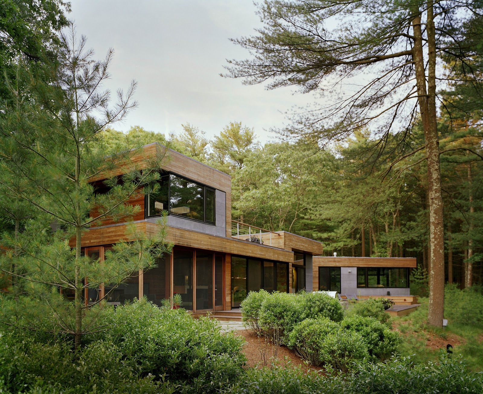
This project developed organically to respond to our client’s seven acre site, which was sheltered by white pines, offered unobstructed views of the water, and housed a beautiful kettle pond. The property contained an existing house, c 1982, which was in need of a major renovation. Because of serious rot and the low quality of the initial construction, it was not clear that a restoration would cost less than a new house. Our instinct is always to save and reuse things rather than throw them away, so we were keen to find ways to keep the house economically. Surveys of the property indicated that the house was closer to the kettle pond than current town setbacks would allow; if we were to build a new house rather than renovate, it would have to be pushed back closer to the property line, compromising the privacy and water views that made this parcel so appealing.
While the existing house was full of quirky layout moments, such as dark narrow halls and high windows facing the view, the basic parti of the house worked quite well — living spaces bookended by the master suite and guest bedrooms. By filling in a windowless courtyard and carport, we were able to enlarge the kitchen and dining areas, and add a den and a screened porch without extending the actual footprint of the house. This not only allowed for extra space, but also dramatically improved the awkward flow between the existing spaces. Without moving load-bearing walls, we merged the kitchen, living and dining areas into an open, flowing plan.
We transformed the appearance of the house with an economy of means using new siding and windows with accenting cement panels. The windowless ‘silo’ stairwell was replaced with a rectangular stair tower with a simple but delicate stair of blackened steel. Wide expanses of glass and exterior materials that cross over into the interiors, such as the cedar siding and cement panels, blur the line between inside and out. The interior palette of natural materials, colors, and fabrics is juxtaposed with occasional strong contrasting elements, complementing the surrounding woodlands.

Source: archdaily.com

Sunday, 2 June 2013

Under Pohutukawa Beach House

Under Pohutukawa Beach House by Herbst Architects


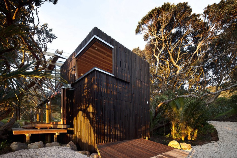
The site with which we were presented was extremely challenging in that it was 90% covered in mature pohutukawa trees, the site being a part of a continuous belt of forest that edges the road along the beach front.
The circumstances not so much allowed, but dictated a sensitive poetic response to a building that, in order to exist would require the destruction of a large number of mature trees. To do this we looked to the trees themselves to give us the cues that we needed.
We separated the brief loosely into private and “public” components, giving us smaller individual masses with which to articulate the forms. The private functions of bedrooms and garage are housed in two towers which are construed as freshly sawn stumps of the trees that were removed.
To allude to the bark of the stumps the skins of the towers are clad in black/brown stained rough sawn irregular battens. The interior spaces are then seen as carved out of the freshly cut wood, achieved by detailing all the wall / ceiling and cabinetry elements in the same light timber.
The public space connects the two towers and attempts to engage with the surrounding pohutukawa forest by defining a crossover space between the powerful natural environment and the built form. The plane of the roof form pins off the towers to engage with the continuous tree canopy, disintegrating from a rigid plane to a frayed edge which filters light in a similar way to the leaf canopy.
The primary structure holding up the roof is a series of treeelements which allude to the trunks and branches of trees but are detailed in a rigorous geometric arrangement which suggests an ordering of nature as it enters and forms the building.

The height of the public space with its light glass division responds to the height of the surrounding trees, the roof planeis partially glass to allow the full extent of the trees to be felt as they lean over the building. A walkway links the towers at the upper level allowing engagement with both the natural and man made canopies.

Saturday, 1 June 2013

MDT house

 MDT house by Jacobsen Arquitetura.
(Source: knstrct.com)


São Paulo’s Fazenda Boa Vista development is a massive 1,800 acre residential and hospitality complex rolling with perfectly trimmed hills, deep blue lakes, and untouched landscapes. The property features an array of amenities such a clubhouses, an equestrian center, golf course, tennis courts, five star hotel, and a spa. Also within the complex is a collective of newly built residences designed by Brazil’s architectural headliners, Isay Weinfeld, Arthur Casas, and Paulo Jacobsen and Bernardo Jacobsen of Jacobsen Arquitetura.
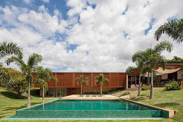
Jacobsen’s new MDT house is in the well designed company of Fazenda Boa Vista’s newly built residences. The home is sectioned into three rectangular volumes that are juxtaposed together to create three full patios, a gourmet kitchen, home theater, large entertaining areas, a kids room, library, and a swimming pool.
The outside of the MDT home is outfitted with a stone wall covered in vertical wood panels ranging in hues of brown, orange, and yellow. The stone and wood wall constitutes most of the exterior walls, except for the areas that overlook the pool and courtyard. Here, the bedroom suites fit straight into one of the rectangular volume, each bedroom has a glass wall so guests have a view of the swimming pool through the wood panels.
One feature not to be missed is the large wood covered patio that overlooks the pool. On the patio, modern furniture pieces create unique conversation areas, and the gourmet kitchen is only steps away to feed the need for serving and entertaining.
The architects took a topographical approach to develop to sculpt the land of the MDT House. Variations in floor and ceiling create different ceiling heights and different relationships with the garden,
sometimes enabling direct access to the gardens and pool.


Source: knstrct.com

Museum for Architectural Drawing

Museum for Architectural Drawing by Speech


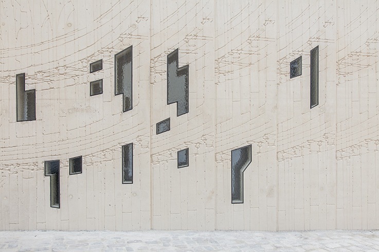
Architectural sketches and motifs are etched across the concrete walls of the Museum for Architectural Drawing in Berlin by Russian architecture collective SPEECH Tchoban & Kuznetsov.
Architects Sergei Tchoban and Sergey Kuznetsov of SPEECH Tchoban & Kuznetsov designed the building to house the collections of the Tchoban Foundation, which the architect founded in 2009 as an archive of architectural drawings from the twentieth and twenty-first centuries.
Located on the site of a former brewery, the five-storey museum will be the foundation's first address and comprises a stack of overlapping concrete volumes with a glass penthouse positioned on top.
Architectural reliefs cover all three of the yellowish-grey concrete facades and form repetitive patterns. The surfaces are also broken up into groups of gently angled planes, intended to mimic overlapping sheets of paper.
"This artistic touch is supposed to emphasise the function and contents of the exposition in the museum's architectural look," explain the architects.
The ground floor of the building accommodates an entrance hall, shop and library. The collections will be housed on the three middle floors and will only be accessible by appointment, while the the glass penthouse and roof terrace will function as an events space.
The Museum for Architectural Drawing is set to open in June and will present both a permanent drawing collection and loans from international collections.
Architects Sergei Tchoban and Sergey Kuznetsov have worked together on various projects as SPEECH Tchoban & Kuznetsov. Their past collaborations include curating the Russian Pavilion at the 2012 Venice Architecture Biennale.

Source: dezeen.com

Hawthorn Residence

Hawthorn Residence by Canny


The initial client brief was to create a home that would allow independent living zones for the needs of the growing family. With three teenage boys the home allows ample breakout spaces for the children to be active and yet still enjoy the togetherness of combined family areas. The clients required a new home with a traditional façade to the compliment the streetscape, yet a more contemporary feel as one moved through to the rear of the home. The front rooms took on a traditional feel, whilst the rear presented more modern attributes.
The rear of the home showcases a distinctive curved pool house with expansive pool outlook. Dual outdoor entertaining areas with canopy skylights and recessed alfresco heaters allow for continuous enjoyment throughout all seasons. All of these elements were carefully integrated and designed with the landscape.
The highly detailed cellar is perhaps the standout feature of this residence. Complete with 2,000 unit wine storage, Vintec wine fridge, tasting bench, sink and luxe wooden joinery, the room carries an understated opulence and serves as a unique entertaining area for intimate dinner parties and tastings.

Source canny.com.au


Friday, 31 May 2013

Palace of Justice

Palace of Justice by Claus en Kaan Architecten, located in Amsterdam.
(Source: archinect.com)


The new premises of the Magistrates Court and the Public Prosecutor form part of the stacked program of the Western IJ-dock complex. The design conforms to the given complex spatial envelope envisaged by the master plan drawn up by Van Gameren and Mastenbroek. Not only a stringent limitation of the form and interior, but also the tight budget and other strict conditions determine the design.
Nevertheless, a unique solution has been found for this public building of 34,000 m2 that accords with the public and representative significance of a magistrates court. The main characteristic is that of a public building with a strict security policy that has separate logistical programmes for the magistrates, suspected and convicted parties, and the public. This results in a spatial palette ranging from a representative character in the public areas, via a congenial working climate for those employed by the court, to the watertight logic of the zones for suspected and convicted parties.
This complexity of the assignment is further reinforced by the considerable number of parties involved. Within all these parameters a clear organization has been chosen in which the office functions of the Public Prosecutor and the Magistrates Court are each accommodated in separate volumes and connected with one another by the walkway on the central fifth floor. The central zone of the Magistrates Court contains the lofty public hall with the courtrooms on either side of it and above it the offices, which are grouped around a large patio.

Status: Built
Location: Amsterdam, NL
Source: archinect.com

Morris A. Mechanic Theatre.

Morris A. Mechanic Theatre.


The Morris A. Mechanic Theatre is a playhouse at 1 North Charles Street that is part of the Charles Center of Baltimore, Maryland. The theatre was built by and named for owner Morris A. Mechanic who operated a number of theatres in the city.

The Mechanic Theater consists of a square podium that houses retail space and an underground parking garage as part of the Charles Center. The fan-shaped auditorium that seats 1,614 sits on top of the podium and has a street-level entrance on Hopkins Plaza as well as a pedestrian bridge that connects to an elevated walkway leading to other buildings in Charles Center. Balconies are behind the orchestra seats and protrude beyond the exterior walls to give the building the appearance of a ratchet gear when viewed from above.
The exterior of the building is rough concrete that bears the markings from the wooden forms used to create the walls. The street entrance on Hopkins Plaza leads to a stairway that takes patrons to the lobby on the second floor. The exterior lobby wall is glass while interior walls have a faux wood finish or are covered with burnt-orange vinyl. The plaza-level entrance is framed by towers holding stairs and elevators to access the balcony. The stage house is clearly defined as a separate element attached to the auditorium.
In November 2009, the British newspaper Daily Mail reported that Virtual Tourist.com named the Mechanic Theatre as number one in its list of the Top Ten ugliest buildings.

The New Gerngross

The New Gerngross by LOVE architecture and urbanism, Vienna, Austria.


Architects: LOVE architecture and urbanism
Location: , Austria
Project team: DI Andreas Perchinig, DI Sigrid Derler, DI Dr. Uwe Unterberger, DI Sabine Sternbach
Client: DEKA Immobilien Invest GmbH
General planner: Delta Projektconsult GmbH
Electrical Planner: energieeffizienz gmbh
Structural engineering: KS Ingenieure
Lightning design: Bartenbach Lichtlabor
General contractor: Leyrer & Graf
Photographs: LOVE architecture and urbanism

Restructuring the Existing Centre

The layout of the store was not intuitive. Walkways were complex and confusing, and it was difficult to navigate. To improve this, the layout of the indoor levels (G, 1st, 2nd, and 5th) has been entirely re-designed and smaller retail spaces have been added. The key to designing the individual levels was to think “empty” in order to enable the future implementation of an improved orientation system.
The preconditions for this complex undertaking were: – For each rental space, a newer space of equal size but higher quality had to be provided. – Each tenant had to be relocated twice during the construction time. – The ongoing daily shopping activity should be only minimally disturbed.

Create a new Centre!

To this end, the atrium, with its escalator network, took centre stage. The atrium serves as the nucleus and has become the store’s central orientation point.
Source: archdaily.com

Thursday, 30 May 2013

Villa 3S

Villa 3S by LOVE architecture and urbanism, Austria, 2010.


Villa 3S is located on a picturesque property on the fringes of Graz Geidorf.  One of the fundamental ideas was to incorporate the relatively large property into the living space.  Therefore, the design blurred the boundaries between house and garden creating fluid transitions and an extended exterior living space.  The relatively strict land-use plan, which stipulated a saddle roof with a designated inclination, presented a further challenge. The roof form begins by folding on the southern terrace continues up and over the building structure and thereby forms an abstract saddle roof.  This folding spatially differentiates the individual areas providing excitement.  This also creates unique views from every angle of the home.

Architects: LOVE architecture and urbanism
Location: Graz Geidorf, 
Construction Calculation: Hartmth Petschnigg
Building Physics: Roland Müller
Project Area: 145 sqm
Project Year: 2010
Photographs: Jasmin Schuller

The architects describe the house as, “Simple yet complex; clear but also playful; light and optimistic; small yet also big.  A place that is architecturally distinct, yet eminently livable; unconventional and unique, and still functional for everyday living.”
The interior of the house is centered around one main room for cooking, eating and living. When open, large sliding doors between the individual rooms connect a fluid, complete spatial structure. With the sliding doors closed, each room maintains its intimacy and distinctiveness and also extends to its own outdoor area or access. For example, the bathroom has its own opaque terrace with an outdoor shower, which can be converted to an interior room with the use of broad folding doors. Weather permitting, the bathroom space can be doubled in this way.
The building is a massive brick construction with concrete walls and a reinforced concrete roof. This roof also serves as a thermal storage mass to provide a pleasant indoor climate and is covered with wood outside. This shades the planking and visually blends the terrace and roof into a unified whole.